In the last post about Thermometer plots in R, I updated with a quick example of something similar in Excel. John asked how it was done.
It is a stacked column chart with some dummy series.
For each category, there is one row of data, one row of 100 minus the data, and one row of a gap = 50.
The first version of the chart shows all the series.
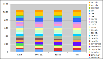
Now we format all the data to be the same - here black lines with black fill.
Format the 100 - data to be the empty part of the thermometer. In the last post I used gray; here I use black lines with no fill.
Format the gaps as no lines, no fill.
Adjust the grid lines to 50 to match up with the gaps. Further tidy up.
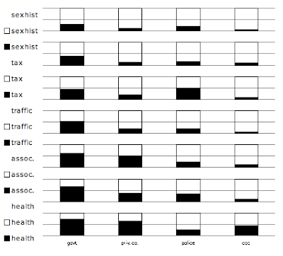
Finally for the legend, we can remove the individual entries for the data and 100-data. This leaves only the legends for the gaps, which do not have any symbols with them.
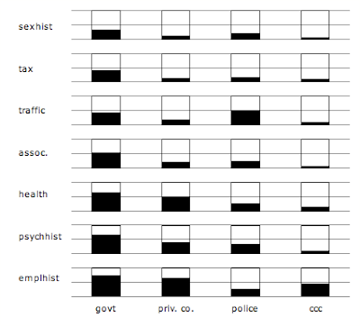
Note that when you remove entries from the legend, select the legend, then select the entry, then delete. Make sure you select the whole entry, rather than just the symbol (e.g., the little black square). Otherwise you will delete the whole data series instead of just the legend entry.
Finally, if we want to look a bit more like the R version, we can eliminate the grid on the whole chart and just put in the 50% markers on each thermometer. Beyond saying this involves another row of dummy data, I'll leave this as an execise for the reader.
Saturday, November 29, 2008
Saturday, November 15, 2008
Thermometer plots in R
R has the ability to create thermometer plots. I first heard of these from "The Elements of Graphing Data" by William Cleveland. In fact I created some by hand before I realized that they are built into R's 'symbols' function. (They are not difficult to make by hand and of course give you some more flexibility.)
Here is an example, based on Problem 2.40 from "Statistics and Experimental Design in Engineering and the Physical Sciences," by Johnson and Leone.
A typical way is a clustered column chart (Excel's term). But which way to cluster?
or
In either case, it is sort of easy to compare within clusters, but less so across clusters. The color helps, but in either case things are cluttered. The separated legend requires you to look back and forth.
The thermometer plot has a 3-D layout for this 3-D data.
I find it easy to scan the rows and the columns in this plot.
Other 3-D arrangements I've seen use either scaled bubbles or pie charts instead of thermometers. The problem with bubbles is that the scale is not so intuitive; do you scale the bubbles by radius or area? (Excel offers both options.) The thermometer varies cleanly in one dimension. Which is easier to read than the angles in pie charts.
Of course, the thermometers can also be used to plot a third dimension on an x-y-z plot or on a map, rather than a regular grid of categories like this example.
UPDATE 11/16:
The example thermometer could be done in Excel.
But not so easy to put them on an x-y-z plot or a map.
Here is an example, based on Problem 2.40 from "Statistics and Experimental Design in Engineering and the Physical Sciences," by Johnson and Leone.
A Roper Report issued in 1974 estimated that citizens (in the percentages indicated below) would not object to (1) a government agency filling a sensitive job, (2) a private company, (3) local police, or (4) a "credit card company" having the following data:
(1) (2) (3) (4) Employment records 74 64 27 44 Psychiatric history 66 38 34 10 Health records 64 50 25 13 Memberships, Associations 53 20 22 7 Traffic violations 43 19 50 8 Tax returns 39 13 15 10 Sexual history 31 12 20 5
Represent these data pictorially, and comment.
A typical way is a clustered column chart (Excel's term). But which way to cluster?
or
In either case, it is sort of easy to compare within clusters, but less so across clusters. The color helps, but in either case things are cluttered. The separated legend requires you to look back and forth.
The thermometer plot has a 3-D layout for this 3-D data.
I find it easy to scan the rows and the columns in this plot.
Other 3-D arrangements I've seen use either scaled bubbles or pie charts instead of thermometers. The problem with bubbles is that the scale is not so intuitive; do you scale the bubbles by radius or area? (Excel offers both options.) The thermometer varies cleanly in one dimension. Which is easier to read than the angles in pie charts.
Of course, the thermometers can also be used to plot a third dimension on an x-y-z plot or on a map, rather than a regular grid of categories like this example.
UPDATE 11/16:
The example thermometer could be done in Excel.
But not so easy to put them on an x-y-z plot or a map.
Monday, November 10, 2008
Market Share Changes - Peltier
Jon Peltier passes on a challenge to improve a stacked bar chart.
The usual problem is that the bar chart only lines up on the first segment.
So why not line up all the segments?
This chart was done in Excel with blank series to line up the centerlines. (It is more straightforward in R.)
It is true that it isn't obvious from this chart that the five competitors shares add to 100%, but that is also true for most of Jon's alternatives.
Note that this also works in black & white / when xeroxed.
I call it an exploded bar chart, but only because I don't what its real name is.
UPDATE:
Jon comments that the changes are less obvious when they are split top and bottom. Well one can line up the baselines instead. It becomes a panel of bar charts.
Sunday, November 2, 2008
Matter of Choice - Junk Charts
Junk Charts has a pretty bad bubble chart from NYT Magazine showing opinions on abortion.
Suggested improvements include a profile chart and a tornado chart.
I prefer this stacked bar chart:
The usual knock against the stacked charts is you can only really judge the size of the bars at the ends. In this case I think that is fine. The extreme positions and the total blue and red seem most interesting, and those are immediately apparent.
Legal in all cases follows what you might expect by party and by gender.
Legal in all or most cases follows the expected by party, but is even by gender.
Illegal in all cases doesn't have as much variation - and in fact slightly more Dems support this than Independents.
The tornado chart lines up the "Most" categories, rather than the extremes.
Subscribe to:
Posts (Atom)